

Never cut the stripes
On Nebraska football's first full uniform redesign in nearly 25 years.

Apologies in advance—I’m a uniform guy. When Nebraska’s alternate era began in 2012, I’d write impassioned breakdowns of every detail every year, why I thought things worked, why I thought they didn’t.
In more recent years, I’ve made a conscious effort to hide my uniform obsession some. I realized it was pretty obnoxious, offering so much detail when the majority of people seem to fall in a “I don’t care, just win” category. I also got an external push in that direction by simply getting older while alternate uniforms exploded. Good design quickly became less important than new design.
But when Nebraska unveiled the first major overhaul of its base uniforms since 2002,1 I knew I was coming out of retirement. As I wrote this on Sunday, I considered it a Father’s Day gift to myself.
Sorry about that. Here we go. Overlong obnoxiousness uploading…
The Untouchables
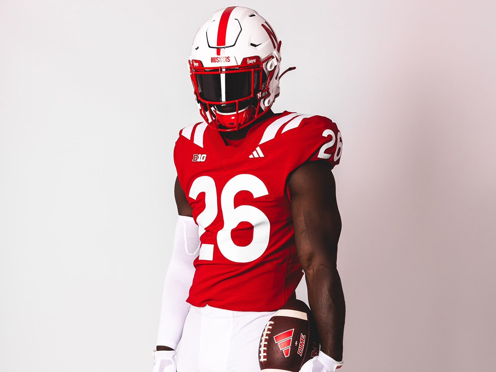
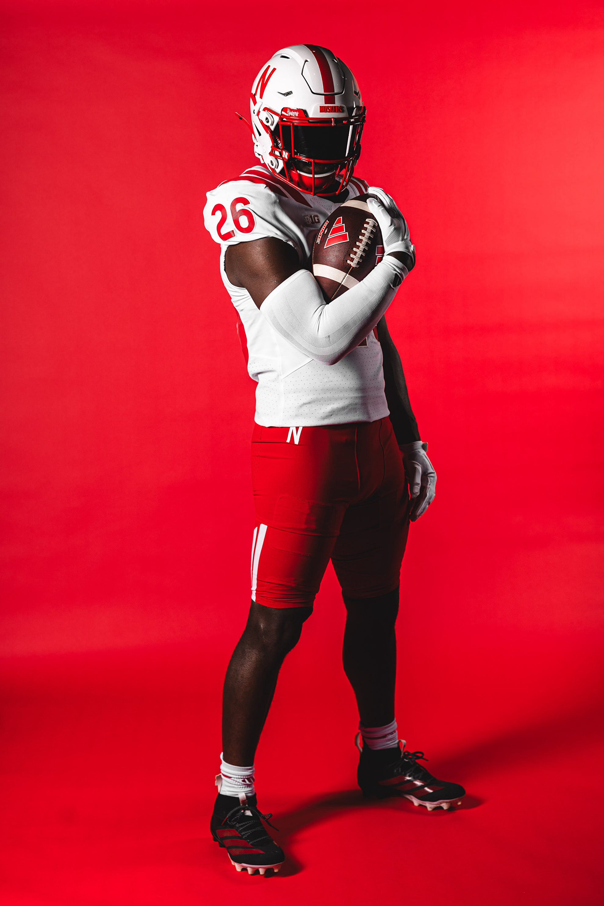
My base position on Nebraska football uniforms is the helmet logo is untouchable. Play with the colors if you must, but the football-N stays in the picture. For most of NU’s alternates to this point, that’s been standard practice, and I felt like a rational person.
For me, the sans serif, football-N isn’t just a personal preference—though I do prefer it over the iron-N—I have a reason. It’s easier if I just show you. See if you see what I see.
Among power conference schools, Nebraska’s skinny, boring, Netflix-esque N—Franklin Gothic, condensed, I think—is actually singular. The sport is stuffed with boring block letters, stylized school logos and mascots. Maybe the best way to picture this is in reverse. Take a classic block-letter helmet—say, Missouri—and make it like Nebraska’s.
Maybe you think that looks terrible. Maybe you think Nebraska’s helmet looks terrible. Point is, the football-N doesn’t look like anything else. Isn’t that worth something? Swap in the iron-N on the Husker helmets and they just become part of pack.
I spent most of 2026 worried this was exactly what Nebraska was going to do based on one sentence around the 48-minute mark from Matt Rhule’s final podcast of “Season 1.”
“There’s rumors out there that there might be the same iconic uniform, but sort of a refresh,” Rhule said in an interview with equipment manager Jay Terry.
Pretty sly, right? First, these obviously weren’t “rumors” to Rhule, not just stuff he heard while out and about in Lincoln. Second, it was preparation for what was to come with the uniform unveil Saturday. Clever placement, deep in the last episode after NU had just been rocked by Utah in the Las Vegas Bowl.
Because I can only control my uni mania, not cure it, I became convinced this meant a switch to the iron-N on the helmets. NU had already obliterated the football-N in basically all other branding, and we were about to lose the only territory left.
But the helmet didn’t change with the uniform revamp, so there are still some things we hold dear. It was even called out specifically near the end of the press release about the new uniforms: “The iconic Nebraska helmet will not change, and the helmet stick N will also remain on the front of the pants.”
Thank you. I needed that.
My other untouchable with the uniforms is perhaps even more esoteric. About 20 years ago I noticed that blue-blood football programs tend to have at least one visual thing in common—single-color, block numbers. Think glorious gold on cardinal, maize on magnificent blue, white on burnt orange. If you’ve got a good color contrast, you don’t need an outline. Those are for the nouveau riche. Boise State and Oregon have outlines, and it works for them. If you are nouveau riche, do it. Don’t dress up like old money, be yourself.
If you need a refresher on the difference an outline can make, revisit the Huskers’ 2023 alternates. The blue outline was a nice nod2 to a moment from the past, but it took the jerseys from Nebraska to New England Patriots retro.
Luckily, the single-color numbers are still here, too. Block numbers? Not so much, but I can budge on that.
The Numbers
Nebraska’s uniform history is pretty deep with non-block numerals. There were the swirly, serifed numbers of the early Bob Devaney era, revived to great effect for a 2009 throwback. The numbers on the back of the Husker helmets have always been sans serif. The 2018 alternates used sans serif numbers on the uniforms that were based on the old Memorial Stadium clock, which was maybe the best thing about that kit.
Even without all of that, you could just argue that if the sans serif helmet is a must-have, similarly designed numbers provide better unity. Looking at the press images, it’ll take a little getting used to after so many years of block numerals, but I suspect I’ll come to like these better. And they’re still single-color.
TV numbers will also appear on the sleeves, which is a good use of jersey real estate.
Finally, there are a couple of practically invisible details in these new numbers. From the press release:
Embracing Nebraska’s agricultural heritage, the jersey number font draws inspiration from the numbers engraved on a steel anvil,3 and incorporates interior lines inspired by the crop rows that stretch across the state’s landscape, connecting the game-day uniform to the land that defines Nebraska.
I like the crop rows thing, even if it has already served its primary function by being just a detail in a press release. I’ve watched too much TV my whole life, and I’ve probably still spent more time looking at crop rows because it takes a long time to drive anywhere in Nebraska and the place is covered in crops.
The Stripes
UCLA changed football fashion forever in 1949 when it debuted a white-gold-white triple stripe encircling the shoulder, a motif that would become so popular that it basically screams FOOTBALL at this point. Nebraska had its UCLA Stripe era in the early 1970s, and those teams won some things, so there’s some heritage here.
Problem is, a classic UCLA Stripe has never worked on modern jersey templates. Not for UCLA. Not for Ole Miss. And now, not for Nebraska. You have to cut the stripe off awkwardly at chest level, and it just never looks right. The abrupt end forces you to wonder, “Hey, what happened to that stripe?” If the new TV numbers were a good use of real estate—because stripes4 don’t fit or, thus, look right there either—a UCLA Stripe is always a bad one. It’s not the stripe’s fault. It’s über traditional, but modern jerseys just aren’t. Resisting this fact is futile
.
All of this is 10,000 times worse on the pants, where NU’s traditional stripe runs from calf to mid-thigh where, sadly, it died like two uncapped chisel-tip markers standing up. What justification5 could there be for this decision? Does it look better than, y’know, regular football pants?
Is it meant to be a very literal, very visual break with tradition? That probably wasn’t the intent, but it’s what these silly pants will represent to me for the length of their tenure. I can get behind the concept of “wrong design,” but this only seems like design for design’s sake.
Overall, I don’t hate this update to the uniforms. The shoulder stripes will continue to bother me, and I’ll seethe every Saturday at the pants, but my two untouchables remained untouched. That plain, boring helmet is still Nebraska’s plain, boring helmet, which is beautiful.
That only leaves one question: Why change the uniform at all?
You knew the answer to that before you read it in a press release, but here it is anyway:
“Recruiting is undeniably the lifeblood of competitive success, and young kids want to wear something sleek, modern, fast, and fashionable. These updates will give a cutting edge to the iconic Nebraska brand. We are proud of the final product and excited for the 2026 season,” Haven Fields, Deputy AD/Chief Operating Officer of Husker Athletics said.
Ahh, yes, it’s “the kids” justification. I don’t doubt there’s a kernel of truth there. I don’t think coaches around the country are lying when they say players ask about uniforms on official visits. I’m sure they do. But how strong is this truth? How much should it guide decision making?
I don’t know better than anyone else “knows.” We do know that Michigan, Texas, Alabama, USC, Penn State, LSU, Iowa, Kansas State, to name a few,6 have put out pretty good football teams year after year in this modern era. If I’m to buy the recruiting justification wholesale—or, worse, parrot that justification the next time I’m on the radio—I must then assume all those schools just listed don’t care about the kids and win anyway.
And what do you do with that? I don’t have a good answer there either, but I do know what you don’t do—never cut the stripes.
It never looks right.
What? That was all fine. It’s not like Nebraska had its first non-winning season in four decades that year. It’s not like everyone revolted so strongly against gussets that the uniforms were mothballed after a year.
It referenced a game against Oklahoma when there was a jersey mix up, forcing the Huskers to wear blue. Speaking of esoteric.
Wait, which anvil? Is there an anvil I should know about? In my days of deepest uni mania, I used to call the language in these releases “jersey jabber.” It’s some of the funniest writing you’ll find.
A thing a useful uniform design tenet might be “if you have to cut the stripes, cut the stripes.”
There is no jersey jabber on this in the release, so we’re on our own.
Actually, it’s not naming just a few. This is a curated selection. For a long time, Nebraska punched with the first six teams on this list and, right now, it’s probably more reasonable to expect it to punch with the latter two. It just hasn’t.
Ooh, I've been waiting for this! Thanks for giving in to the urge, Brandon.